
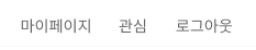
<MenuSection>
  <MenuItem>마이페이지</MenuItem>
  <MenuItem>관심</MenuItem>
  <MenuItem>로그인</MenuItem>
</MenuSection>메뉴 세 개 중 마이페이지와 관심은 누르면 해당 페이지로 이동하도록 해야 하지만, 로그인은 페이지 이동이 아닌 모달창을 띄워줘야 했다.
따라서 상위 두 개 요소는 Link 태그를 사용하면 되고, 마지막 요소는 p 태그를 사용하면 된다.
그렇지만 세 개의 스타일은 똑같다.
이럴 때
const MenuItem = styled(Link)`
  color: #666;
  font-family: Noto Sans;
  font-size: 0.8rem;
  font-weight: 400;
  text-decoration: none;
  &:not(:last-child) {
    margin-right: 30px;
  }
`;MenuItem을 이와 같이 작성해주었다면, Link 태그는 사용할 때 to 속성을 쓰지 않으면 에러가 나기에 마지막 요소에는 해당 styled component를 사용할 수 없게 된다. 그러면 마지막 요소 하나만을 위해서 또 다른 styled component를 만들어야 할 뿐만 아니라 똑같은 css를 중복하여 작성하게 된다.
이런 상황에서 styled-components의 as 속성을 사용하면 조금 더 깔끔하고 재사용성 높게 코드를 짤 수 있다.
as 속성은 동적으로 컴포넌트의 태그를 바꿀 수 있게 해주어, 태그에 상관없이 스타일만 똑같이 공유하고 싶을 때 사용하면 좋다.
다음과 같이 동일한 스타일을 가진 컴포넌트 MenuItem을 생성해주고, as 속성에서 태그를 지정하면 된다.
const MenuItem = styled.div`
  color: #666;
  font-family: Noto Sans;
  font-size: 0.8rem;
  font-weight: 400;
  text-decoration: none;
  &:not(:last-child) {
    margin-right: 30px;
  }
`;<MenuSection>
<MenuItem as={Link} to="/mypage">마이페이지</MenuItem>
<MenuItem as={Link} to="/likes">관심</MenuItem>
<MenuItem as='p'>로그인</MenuItem>
</MenuSection>
'프론트엔드 > CSS' 카테고리의 다른 글
| Next.js에서 TailwindCSS 사용하기 (0) | 2024.04.02 |
|---|